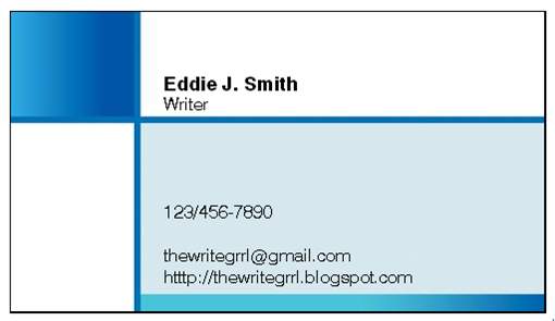
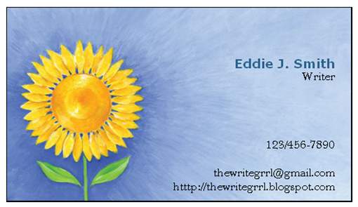
Vote on a Card!
So Eto told me, business cards are a very personal thing...but goddess knows I can't even make up my mind most days on a pair of shoes, a boy or a title for my next story. I need all the help I can get.
Here are my top three picks:


 Any thoughts? Use the comments and holla back!
Here are my top three picks:

 Any thoughts? Use the comments and holla back!
posted by Eddie at 3:55 PM
![]()


12 Comments:
I like all three.
I would choose the first one for a writer. It's business-like but not too stuffy.
The second one is too business-like, too serious.
The last one is pretty but too personal looking.
Nibs- Yeah, decisions decisions! I narrowed it down to three, now it's your turn! I adore sunflowers but that one just looks a bit too girlie (maybe if I were a chic-lit writer). Thanks for your help!
I like the middle one better than the top one, but I can see gold's reasoning.
I like the bottom one, but I think it's a little girly, too.
The top one's pretty good, though, and I ditto goldennib on the middle being a little on the serious side.
Hope all's well with you, darling!
the first one is better... !!
I vote on the first one! It's clean and professional, but friendly. The second one looks a little too professional, and the third looks too informal. These are through Vistaprint, right? I need to get some new cards made up...as soon as I get my webpage done.
Have you seen American Psycho? There's a wonderful scene when these yuppies all compare their business cards :)
Eugene- I just watched the anniversary edition of AP and I LOVE that scene...The look on his face when he's been on-upped is priceless, so controlled yet outraged. Glorious!
Amy - Let's talk Disney...still up for it?
I might be, though I'm still not caught up on episodes of Scrubs or Lost. (And now finals are fast approaching.) I become free officially around the 1st of June, and I think we can bang something out in a week or two if we put our minds to it. Or something. Heh.
I vote for number 1, too. Professional, but cute. Who are you going to get to do your printing?
Stolie: I'm going to go with vistaprints.com -- that's where these designs came from. Also they're free with shipping, so that's a plus when one is a "starving writer." Teeheehee
A little late to log in on this question, but the top one gets my vote. It's clean, contemporary, and professional looking and doesn't carry baggage.
Of course it's totally late but I vote on the first one. The vaguely futuristic repeating dots have little to do with your writing but at least they're not stodgy (second) or hippy-dippy (third). You should get one with a really cool horse picture--if you send it to me I'll design the text for you.
James
Post a Comment
<< Home